 Over the years, Education Law Center (ELC) has become the “go-to” source where parents, policymakers and advocates can find high quality, in-depth data and other useable information on New Jersey’s public schools. This organization is committed to continuing to provide timely and relevant data in a highly functional and interactive format and is pleased to announce that visitors can now find an expanded range of student data on their website: racial/ethnic composition, poverty rates, limited English proficiency rates, and special education rates of NJ public school students, whether enrolled in district schools or charter schools.
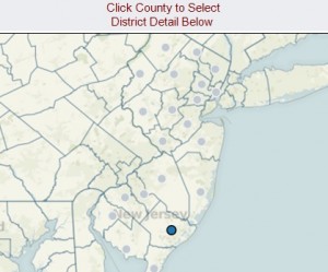
A visitor to the “Data & Research” page on the ELC site will see highly interactive charts and maps displaying student enrollment data by race/ethnicity for school districts across the state. Below that, a second data set displays enrollment in special programs. Interactive elements are in red.
The maps permit a quick scan of the current statewide landscape and identify spatial patterns. Bar charts, organized by District Factor Group (DFG; the classification system used by the New Jersey Department of Education to organize districts by socioeconomic status), illustrate how dramatically student characteristics differ by district type. Data can also be filtered by county, and charts can be sorted in multiple ways (for example, by district or by a chosen indicator in ascending or descending order).
The ELC website also makes it easier to examine historical trends by providing two options for viewing data. The first option compares counties, districts or schools within the same year, with over a decade’s worth of data. Using the second option, a site visitor can choose state, county, district or school level data in order to view longitudinal trends. Using the tabs at the top of the display, it’s possible to toggle between views. Any selections made on one tab will carry over to a subsequent tab.
Telling the Story with Data
The map displaying NJ’s diverse student population illustrates the high degree of racial segregation across the state. The DFG chart can be used to filter the data to show the interplay of geography, socioeconomic status and racial segregation. Filtering the map to view only DFG “A“ districts, for example, it is clear that these districts with the lowest socioeconomic status are predominately located in the northeastern and southern portions of the state and serve large numbers of black and Hispanic children. Alternatively, DFG “J” districts – the wealthiest in the state – are almost exclusively found in the northern part of the state and are more likely to be majority white districts.
The second tab shows student enrollments by race/ethnicity for counties, districts and schools from 1999-2000 through 2011-2012. For example, the data show that in 2011-12, Bergen County student enrollment was the highest in the state (over 130,000 students), while Salem County enrollment was the lowest (less than 12,000 students). Scanning the chart also shows that Sussex County enrolled the largest proportion of white students (88%) and Essex County the smallest (27%). The racial distributions of students in districts and individual schools are available in this view.
In the second set of charts and maps, the data show that while the number of students classified as free and reduced lunch or Limited English Proficiency is related to a district’s socioeconomic status, special education is more evenly distributed across the state. The second tab displays the three indicators together, making it possible to explore how these student characteristics are related. The chart can be expanded so that district data within counties can be viewed and then further expanded to show the schools within districts.
The third tab shows longitudinal data illustrating, for example, the recent increase in student poverty. The number of English language learners and special education students, for the years in which data are available, is more stable.
“The beauty of these data sets is that they make it possible to access over a decade of demographic data in one place,” said Dr. Danielle Farrie, ELC’s Research Director. “The information is displayed in an easy to understand format that can be manipulated by visitors to ELC’s website in order to find the exact data they need, whether they are looking for state level trends or the particular characteristics of an individual school.”

